

For 70 years, ever since Topps created the modern baseball card, they’ve had a look: Player photo on the front, statistics on the back. Sure, there’s been some innovation over the years -- sharper pictures and better card stock, holograms and chrome, the addition of jersey swatches, slices of baseball bats and autographs that drive collectors wild -- but for the most part, the baseball card hasn’t changed.
So, of course, it would be Topps who also decided to upend all of that. It started last year with its Topps Project 2020, which brought 20 artists together to offer a unique spin on 20 of the most iconic cards of all-time.
This year, to celebrate the 70th anniversary of Topps’ first set, it went bigger with Project 70. Forget 20 artists, this time Topps chose 51 (to honor that 1951 set), with every Project 2020 artist returning except for Grotesk, whose commitments to other projects kept him away. The list doesn’t just include visual artists with a soft spot for baseball cards, but some of the most prominent recording artists in the game. That includes rapper-and-late-night-foodie Action Bronson and legendary hip-hop artist Snoop Dogg.
“We were just really trying to keep an eye out for as diverse and interesting of a group as we possibly can,” Jeff Heckman, Global Director of Ecommerce at Topps told MLB.com. “And people like Snoop Dogg -- he's not necessarily a [visual] artist in the truest sense, but he's definitely a creator, and has been extremely creative throughout his entire history. To have someone like that be a part of the program is certainly awesome.”
That’s not the only change. Instead of every creator getting the same 20 cards to play with, now they get to choose almost any player they want from big league history, do anything they want with the image, and pop it inside any of the 70 card designs from Topps’ long run.
“Unlike Project 2020, where we were giving people iconic trading cards -- mostly rookie cards -- and letting them reimagine the cards, in this case, they're creating cards from scratch,” Heckman said. “[An artist] could be like ‘Oh, I really want to do Ken Griffey Jr. and I want to show him on that 1974 design.’ Great!”
Three cards will go on sale every day from Monday to Friday and be available for 70 hours -- see the theme? -- on Topps.com. The project launched on Wednesday afternoon, with three very distinct styles to appeal to every kind of card collector.
Celebrity jeweler Ben Baller, known for his bold, diamond-studded designs, is an L.A. resident and die-hard sports fan who proudly led all card artists in sales last year. He’s a competitor who never backs down from a challenge, comparing his work on the project to showing up to a poker game, telling everyone he’s going to take their money -- and then doing it. Still, he wound up in awe of his fellow artists.
“I truly do believe that every single person that made a card, every single card was awesome,” Baller said of Project 2020. “As far as art goes, I don't think that I was even in the top five.”
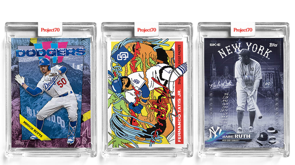
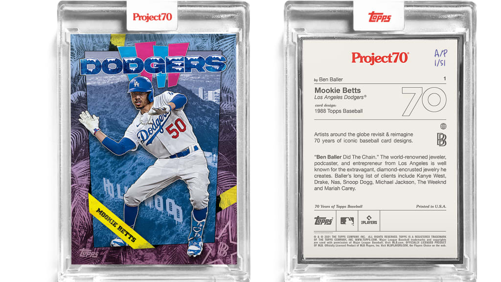
He’s continuing his love affair with the Dodgers and their World Series title -- he had a special celebratory Dodgers set that sold out this past fall -- by kicking off his new collection with a Mookie Betts card.
“I chose Mookie Betts, because, one, sounds crazy, I hate the Boston Red Sox,” Baller joked. “I'm not a Yankees fan, I hate the Yankees, too. But remember, we just lost to Boston two years ago in the World Series.”
But Mookie won him over with his play and on-field dances last year, so Baller opted to use the 1988 card design to honor the previous season that the Dodgers won the World Series.
“When we think of L.A., what do you think?" Baller asked. "You think of palm trees, you think of the Hollywood sign, you think of the Hollywood stars, you think of the beach. So, I threw a little bit of skyline, the Hollywood sign and the Hollywood star -- my logo -- on there,” Baller said, before reminding me that Los Angeles is the only city to win the World Series and NBA Finals in the same year. “And we did it twice,” he said with a laugh.
While Baller goes with glitzy, jewelry-inspired looks, Ermsy’s art goes the other way with bright, cartoonish pop-art takes on the sport. Originally from the UK and now living in Paris, Ermsy was not initially a baseball fan, having grown up on Star Wars, Garbage Pail Kids, and Teenage Mutant Ninja Turtles cards instead.
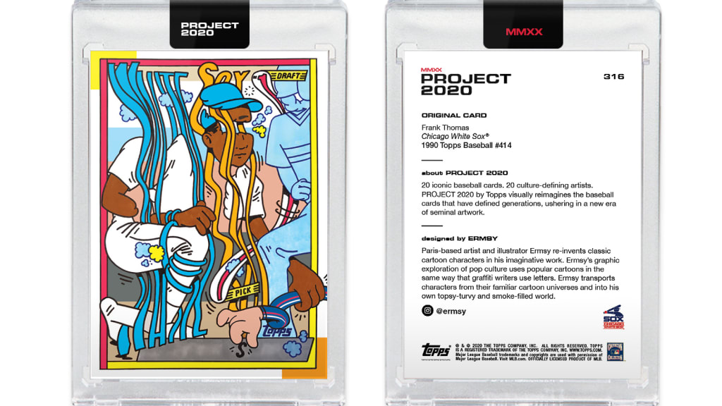
“I think that I approached it with fresh eyes as I didn’t know most of the players, team histories, card histories, nothing like that,” Ermsy wrote in an email. “So, I think it was an interesting clash of what I was doing before in my art career with the world of baseball and baseball cards. I just felt my way into it, and it produced the results it did. And that’s the way I like to do things!”
His first card for Project 70 is Fernando Tatis Jr. -- a player you will see more of from other artists because no one can resist the allure of El Niño -- but none will attempt to capture the superstar shortstop by splitting his face across the length of the card the way Ermsy did.
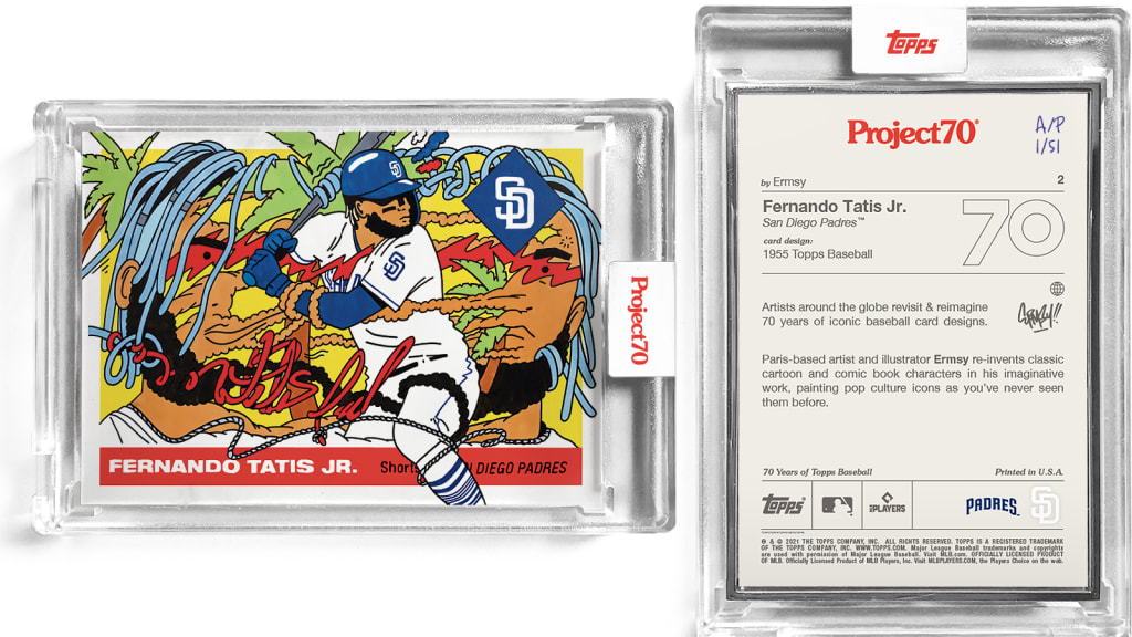
“I wanted to capture the movement and excitement that he has, being such an incredible player,” Ermsy wrote. “I already knew a bit about the Padres after researching Tony Gwynn during Project 2020. So, I mixed in some San Diego palm trees and warm colors, and then jammed with some images of Tatis.”
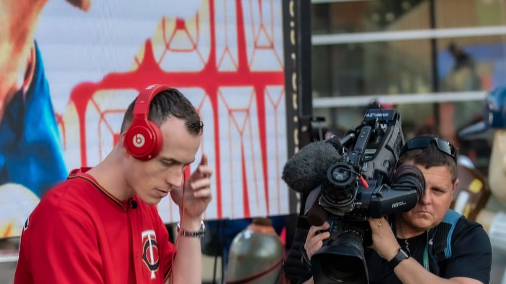
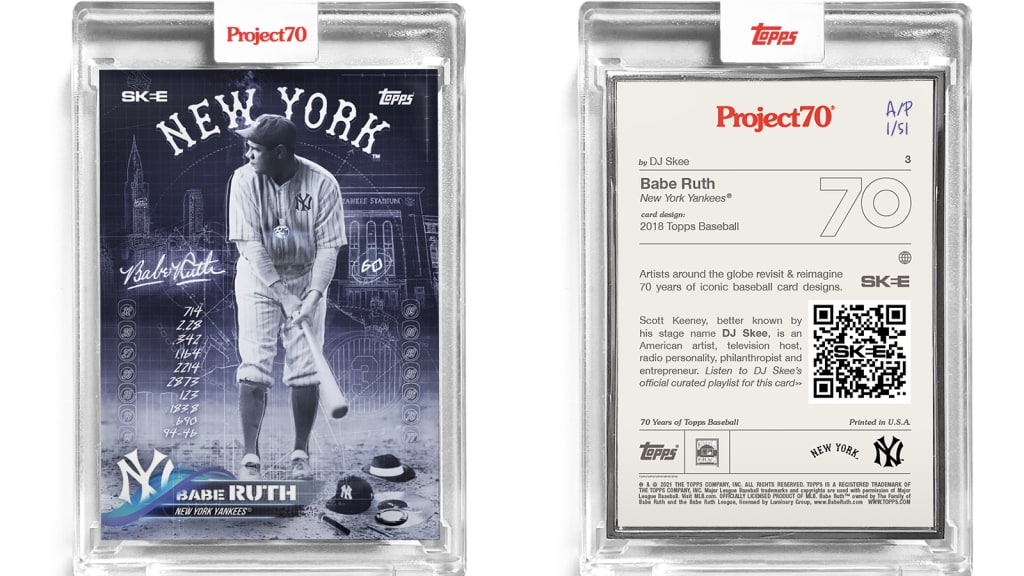
And then there’s the Babe Ruth card from DJ Skee. You likely know Skee better for his music -- whether it's the mixtapes he’s made for Kendrick Lamar and Lady Gaga among others, or for spinning records during Twins games at Target Field -- but Skee has been a big supporter of baseball cards his whole life. He still watches almost every Twins game, and he hosted an interview series with artists during Project 2020.
When picking his first card, his choice was simple: It was going to be the Babe.
“I grew up in Minnesota, but I was actually born in New York City,” Skee said, admitting that a Twins player will definitely be in his collection. "And I've been in L.A. for so long. So, you'll see a lot of cards that try to also tell my story subliminally through them. So, it only makes sense to start with a card in New York with the greatest baseball player, especially as the card hasn't really been touched or remixed.”
Skee’s Ruth is a bit of a play on both the slugger, and also incorporates imagery from Jay-Z’s legendary album, “The Blueprint." You can see nods to the legendary MC in the microphone, record, Yankees cap and overall look of the card.
All of Skee’s cards will incorporate music in some way -- but perhaps not the way you expect.
“It could be everything from a player's walkup song to an artist that was known for wearing the jersey of that player, to obviously being from the same hometown," Skee said.
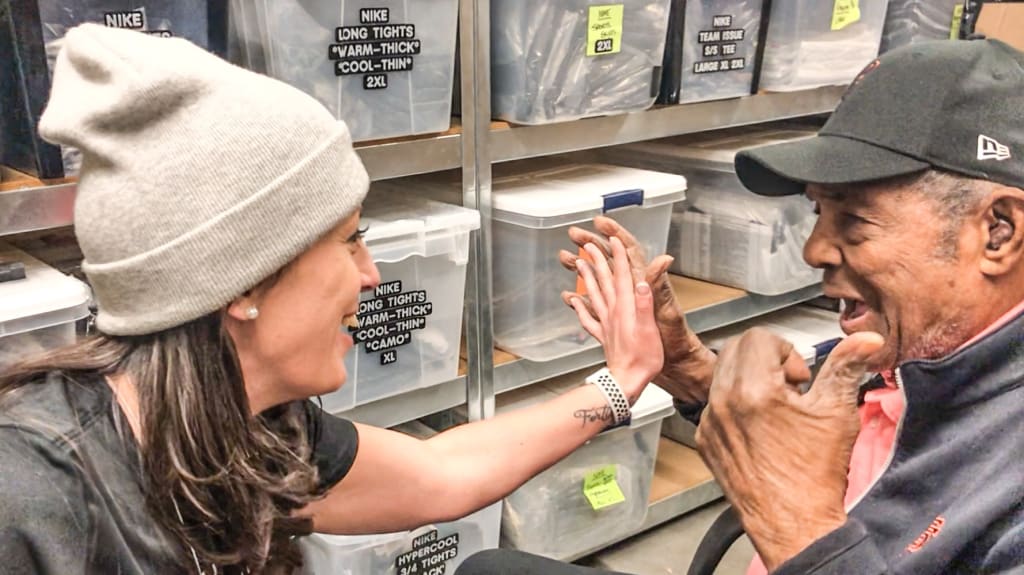
Another new artist with an untraditional background is Lauren Taylor, who admitted she earned her only C in college in art class. But after suffering a traumatic brain injury during a softball game in 2016, Taylor turned to art to help deal with the injury and resulting mental health issues. A highly competitive softball player, Taylor used that same athletic drive to push herself to improve her artwork. That makes this project especially meaningful as Topps had previously rejected her designs just a few short years ago.
While searching her email for a message from Topps recently, Taylor stumbled upon her initial rejection from the company.
“ I could just hear the disappointment and frustration in my responses -- trying to understand why [they rejected me] when I thought things were going so good,” Taylor said. “And suddenly they're telling me like, ‘Anyone in our design team could do this, they're not that special, blah, blah, blah.' I had never been able to re-read those prior because they stung a bit. But instead of bothering me, it made me realize that if you put enough hours into anything, it's going to get better."
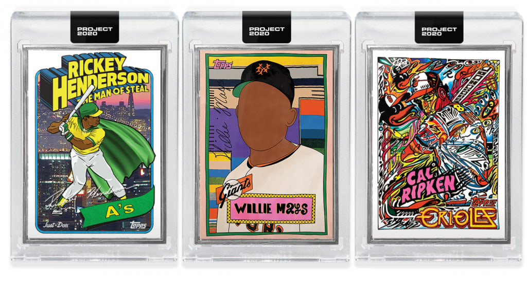
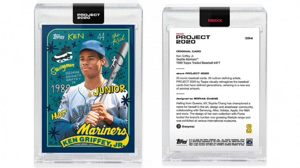
Known for impressively and densely detailed artwork on birchwood panels, Taylor is excited to give people a peek at her cards that will feature childhood favorite Ken Griffey Jr. and Willie Mays -- a player she once told had hands which resembled "meat mitts" in comparison to her own:
“There's so many cool styles out there,” Taylor said. “And everybody has an opinion on who and what and how you should do things, but I figured Topps picked me. And they picked me because they like my art. So, I'm just gonna cross my fingers, hope other people like it and stick with my style.”
While Taylor uses the players themselves to fill with her designs, Sophia Chang instead focuses on the space around them with humorous images, inside jokes and statistical references. So, while she was vetoed from putting one tabloid-reported reference into her Derek Jeter card from Project 2020, she still got to have a lot of fun.
“I wanted to maintain as much of the original graphic design as possible, while at the same time making sure that as an art piece, it kind of echoes the team colors as much as possible,” Chang said. “Then I do quite a bit of research on the player themselves, the cities, the team, what did the player do for the city.
“I think having those cultural moments is important,” Chang added. “Like Ken Griffey Jr. Obviously he's very well known for a Swingman shoe, there's a logo there. With Ichiro, he has his Shiba Inu dog that was super popular. So, having some elements to humanize them, outside of just being a superstar athlete, was important to me.”
You can credit her upbringing in Queens and by riding near old Shea Stadium for her style, too.
“I grew up in New York, and you just had advertisements everywhere -- visual stuff being shoved down your eyeballs,” Chang said. “Sometimes you're walking around in the city, or sometimes you might be in a subway train car, and you happen to see something that stops and catches your attention. So, a lot of my work is inspired by those moments. Being able to invite the viewer to just look at a piece of art and be like, ‘Wait, hold on, oh, I see this, I recognize this.’”
In a way, that’s how the entire project works: Take something old and remix it in a new way that forces people to stop, think for a second, and then desperately need that card for their collection.