

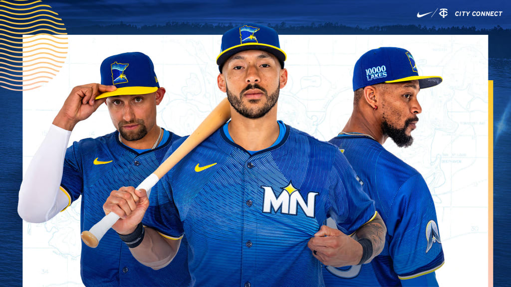
MINNEAPOLIS -- The Minnesota Twins were the first North American professional sports franchise to name themselves after their home state, not their home city -- so, it should come as no surprise that the Twins used their “City Connect” jersey as more of a “State Connect” concept.
The team representing the Land of 10,000 Lakes will thus pay homage to the ever-present water central to the lives of all those in the state and region with their City Connect uniforms, unveiled on Monday morning in collaboration with Nike.
That’s clear in the visual theme around which the uniform is built, unified around an azure blue hue from head to toe, punctuated by the yellow belts and brims of the caps intended to evoke the feeling of the sun shining across a lake on a day at the cabin. They’ll be worn for the first time on Friday and 10 more times through the end of the ’24 regular season, mostly on Fridays at home.
“It's cool that they're different,” Joe Ryan said. “It's cool to get away from what our normal uniforms look like. They did a good job with that. It will be fun to see what works and doesn't work with cleats and have a little bit of our own personal flair in there.”
The overall look, designed in a process that began two years ago, is meant to invoke what the Twins are calling the “Ripple Effect,” which is the tagline around which the design is based. The hope was to go beyond the visual anchor of the lakes and to further embody the vibes and serenity that lakes bring to the lives of Minnesotans -- rippling through their lives, so to speak.
“We really feel like that’s what the Twins do: We create positive action and we hope that that ripples out throughout the community,” said Heather Hinkel, the Twins’ vice president of brand marketing. “So that’s the story we’re going to be telling, along with the jersey.”
The late timing of the Twins’ City Connect reveal was intentional, Hinkel said. They’re the final team to debut their new look (not counting the A’s and Yankees, who are not participating in the program), in large part because the organization introduced its full brand refresh ahead of the 2023 season and wanted to give that a chance to “breathe” before adding another change.
The caps
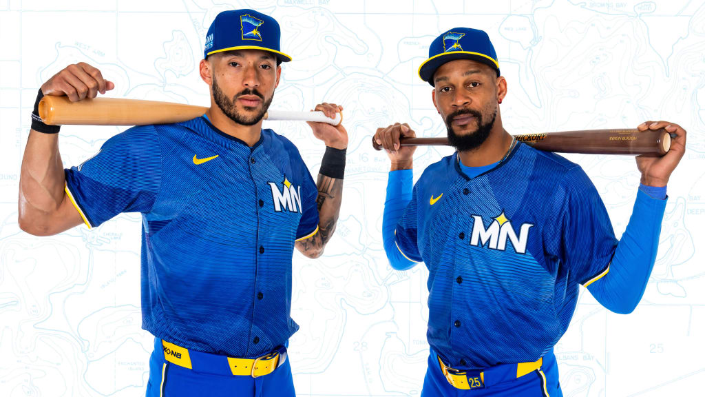
Every element of the uniform is brand new, from the colors to the logos, and that starts at the top, where the dark blue caps with yellow brims boast a new insignia in the shape of the state, outlined in the same yellow accent color.
The logo contains the North Star motif element placed on the location of the Twin Cities, with the backdrop of the Northern Lights reflected in the water line of a lake.
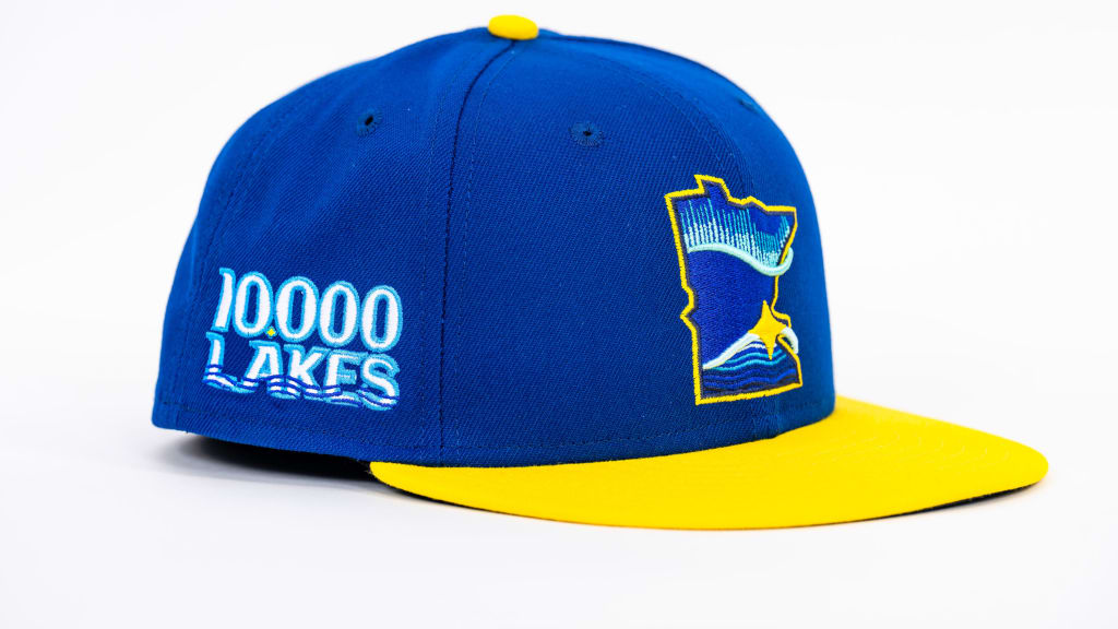
“Really honing in on kind of what Minnesota stands for, where the water reflects the sky,” Hinkel said. “It doesn’t necessarily say Twins, but it really speaks to Minnesota.”
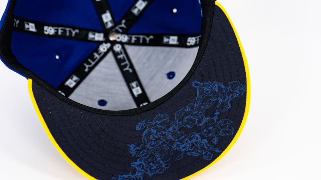
In addition to a “10,000 Lakes” decal on the right side of the cap, there’s also a little hidden Easter egg detail on the bottoms of the brims, where there’s a topographical depth map of Lake Minnetonka -- a subtle nod to Prince’s line from the “Purple Rain” movie about purifying oneself in the waters of Lake Minnetonka.
The jerseys
The most striking visual element is the sublimation pattern on the jersey tops, involving several different hues of blue run through by black striations, with the overall look meant to represent the effect of ripples in the surface of a lake.
“I just like being different over just navy blue, red, white,” Byron Buxton said. “Let’s bring in a little bit of yellow. It’s different. I know it’s got a little bit of pinkish in it. That’s cool. Just to bring out different colors, for me, that’s something fun. You can kind of make different accessories.”
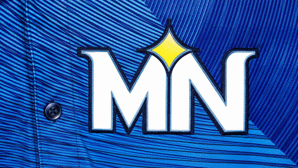
Instead of a wordmark across the front of the jersey, the Twins opted for a chest patch with a white “MN” logo once again integrating their North Star motif, in a clear effort to represent the entire state instead of leaning too heavily into Minneapolis and St. Paul. (The normal “TC” logo, the Twins’ primary mark, which stands for “Twin Cities,” is absent altogether from the design.)
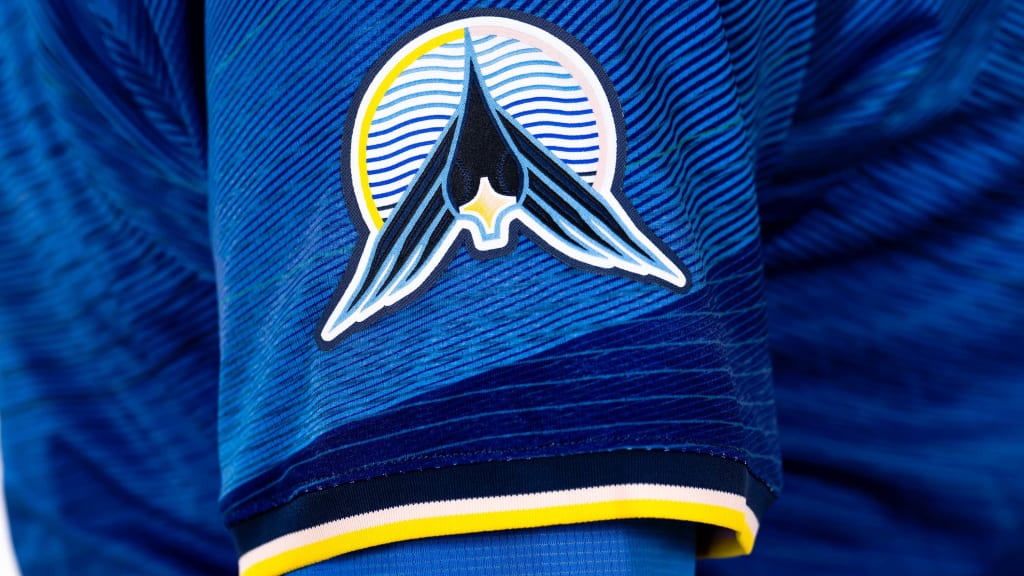
On one sleeve is another alternate logo unique to the City Connect design: a loon flying across rippling water, with baseball stitching composing the eyes of the loon and the North Star making up its beak.
The pants
The current design opted for solid blue pants to unify the look from head to toe, along with the neon yellow belts. The pants also include piping along the sides in yellow, black, white and even a subtle pink, representing the varied colors of a sunset, which also appear on the piping on the sleeves and the outline of the loon logo sleeve patch.
“That’s to reflect the hues of the sun setting over the lake,” Hinkel said. “When you get that great sunset, it’s not just bright yellows. There’s some pink hues in there, so we’ve added the piping here.”
This year’s iteration of the City Connect uniforms will use the blue pants, though there’s some thought that the Twins could switch to white pants with this look in future seasons.
The launch
As part of the Twins’ launch festivities at the ballpark on Monday, the Twins will host local artists to paint 20 Adirondack chairs live on the plaza to represent the new look and the “Ripple Effect.” Those chairs will be auctioned off, with benefits going to local nonprofits.
The event will mark the first opportunity for fans to buy City Connect merchandise and will feature live music and a lunch on the plaza. The Twins will also be present with a City Connect-themed presence at the Stone Arch Bridge Festival from June 15-16.